

Opal+
Gamifying the nightly commute boosted engagement and motivation for Sydney's late-night shift workers using the city's largest public transport service.
UX/UI Design, Experience & Usability Testing, Prototyping.
Roles & Responsibilities
Team Leader: Project Management, setting visual design standards, driving design vision, communicating ideas and insights, and managing feedback.
User Research: Desk Research, 3 User Interviews, User Persona & Journey Mapping.
UX Design: Ideation, Mid-Fidelity to High-Fidelity Prototyping, roleplay experience testing.
UI Design: Style Guide, Colour Pallete, Typography, sourcing 3D Illustrations, UI refinements based on feedback.
Timeline and Team
2.5 Months, Autumn 2023.
Piti Pichedpan, Akibur Rahman Choton, Tony & Ken.
Tools
Task Management: Trello
Ideation & Design: Miro, Figma & Adobe Photoshop.
Background
Opal+ was a project made as a part of one of my core classes at UTS, ‘Advanced Interaction Design,’ where students were divided into teams of 5 and tasked to work on a given problem statement and formulate an MVP to test with users. My group chose to work with Opal Travel's application used for public transport services in Sydney and most other urban areas in New South Wales, Australia.
Problem
The Sydney Business Chamber, on their Night Shift Moving Sydney to a 24-hour City, claims to get our city moving 24 hours - to build a better, safer and more diverse nighttime economy. Desk research indicates that our primary users - nurses, cleaners, share traders, financers and the like – are virtually abandoned by their city and by the public policies of Governments. Public transport and retail stores shut down, stranding them when their shifts end. Opportunities to socialize are almost non-existent.
Moreover, User interview analysis data shows that the nature of shift work is hard, and many find their everyday commute to work boring, unmotivated and experience self-pity.

How might we alleviate the mundane commute experiences of night shift workers while enhancing engagement and motivation for individuals?
Solution
Seamless Onboarding Initiation:
Swiftly enter the Opal+ experience.
Scan Opal+ QR to verify travel authenticity and real-time journey activity.
Build a personalized profile based on users' night shift representation.
Tailored Gaming Experience
Get a personalized Opal+ Game Card.
Join the active game suggested by Opal+ or browse the available games.
Get notified when the destination arrives and save the game to claim winning rewards.
Collaborative Credit Accumulation:
Earn tangible credits in the form of a travel credit from Opal+.
Preview saved current and previous games played and credits gained.
Use Opal+ as a digital card to tap on/off for the next journey.
Our Approach
Define
Understanding problem scenario
Defining project goals
Design methods
Strategy: Setting timelines and task allocations (based on team strengths and Interests)
Research
Desk Research
User Interviews (3)
Inductive Coding
Thematic Analysis (Insights)
User Persona (2)
Journey Mapping
Design
Ideation (3)
Design Peer Review
Set Design standards-(Style Guide)
User Flow
Mid-fi Wireframes
High-fidelity prototyping
Testing
Usability test user scenarios
Heuristics Evaluation + Design Refinement
Experience Test Scenarios
Roleplay as User
Experience Testing + Design Refinement
Things I led
Research
I first conducted desk research to identify the problem's scope and three semi-structured in-depth user interviews focused on understanding night shift workers’ individual commute experiences. The data were transcribed, grouped, and analyzed to frame insights and create a persona, journey map and design ideas. Through my research, I also concluded that users use TripView or Opal Travel application to plan their daily trips and stay up-to-date with real-time travel information.
Analysis
Through Inductive Coding, I synthesized the interview data into an affinity map to help form groups and kickstart our group brainstorming sessions.
Insights
I generated the following insights based on the affinity map by grouping similar notes under similar headings.
Group 1: Time-Constrained Travelers
"My 45-minute commute to work feels like wasted time, especially during 8 pm. I wish there were something to do for myself then. All I do is listen to music and try to relax."
Insight 1
A nighttime commuter feels that the time taken to travel could have been readily utilized somehow to be productive.
Insight 2
Thoughts of life, the city winding down, and how his/her life is compared to others often kick in.
Insight 3
YouTube, Instagram and Tiktok are the best ways to escape reality, resulting in self-pity of time invested in Social Media.
Group 2: Community-Driven Commuters
"It’s pretty quiet at 11:30pm - 12 am when I head home and often I feel alone and bored while coming back home late. It would be nice just to have a chat about my day."
Insight 1
Night-time shift workers feel frightened and alone. They seek a safe and relaxing environment during commutes.
Insight 2
The sense of being “the last guy” often has adverse effects on their mood. This affects work and mental stability.
Insight 3
The ability to be seen for their work is a form of validation that night-shift workers often seek.
Group 3: Wellness-Oriented Travelers
"The commute home can be the most stressful part of my day. Having something to take my mind off things would be a lifesaver."
Insight 1
Shift work during the night time is hard in nature resulting in a lack of proper sleep and healthy habits.
Insight 2
Night shift workers need something to forget about their work and focus on other tasks that are beneficial to them.
Insight 3
Lack of satisfaction, and work-related stress often adversely affect health, and they seek solutions for their well-being.
Persona & Journey Map
Based on our insights, I created two personas. One of them was Raj, who represented our user group. I captured his everyday commute pattern and lifestyle and highlighted his needs/goals and frustrations. On the other hand, the journey map showcases Raj's regular commute to work and the pain points—this unfolded design opportunities for my team. Moving forward, these two artifacts were crucial for our team to refer to and keep the user in front and center.

User persona

User Journey Map
Design
Given our research findings, we devised three divergent design ideas that tackled the problem space. These spanned from building a Night Travel Learners (e-learning app), Night Cravers (Night Local Food Finder) and Opal Games (collaborative online game session).
Peer review
We pitched our design Ideas to three diverse audience groups to evaluate and verify the best Idea that efficiently solves the problem. An online vote was made to assess interest in the designs, and the audiences we presented were:
Classmates/peers during our tutorial sessions at UTS.
Faculty and Tutors (Stakeholders) and,
5 Night shift workers from our Interviews.
We chose the design idea with the highest score for option 3 – Opal Games.
The review showed us that the concept was scalable, focused on the engagement of daily commutes, and, given Opal Travels' more extensive customer base, would be a more thoughtful way for adoption.
Benchmarking design standards
Design standard 1: Respecting Opal Travel.
To integrate our idea successfully within the Opal Travel application, We first had to understand the existing branding and UI design language. To do so, I broke down the present Opal Travel app design elements for our team, which include Grids for spacing, consistent typography, buttons, color palette, and iconography. I wanted to ensure we don’t redesign, respect the present design, and seamlessly add our new ideas.

Spacing, Color and Grids system.

Specifying cards and dividers

Typography sizes
Design standard 2: Being Memorable.
The initial name we decided on during our Ideation phase was Opal Games. However, I believe our solution offers more than just games. Therefore, to visually represent “add on/upgrade,” I described it as a “+,” which means an additional edge added to your commute experiences and an indication of the free upgraded service provided by Opal Travel.
Design standard 3: Association through colors.
Lastly, the intended use case of Opal+ would aim to uplift commuters' motivations during nighttime commutes. Therefore, I drew inspiration from the Sydney train carriage's exterior colors and Opal Travel logo mark to represent the same. It provided a blended sense of energy and fun (where Orange evokes joy, warmth and enthusiasm, and Yellow elicits happiness, energy, and optimism).
Modified Opal+ Logo.

Color palate inspired by Sydney trains exterior.
Iterative Design & Testing
We decided to design our Mid-fidelity prototype of the app tailoring to address the 3 major user pain points specifically (Group 1,2 & 3). To do so, we used our design artefacts as our base. In specific, we used the User persona and User Journey to aim the needs, User flow developed by my teammates based on rough sketches of our selected Idea, and the style guide I created as Interface guides. Moreover, we decided to continuously evaluate the app’s usability and navigation while we design the rest of the critical features.
Thus, to evaluate and gain feedbacks into the user flow, usability and experiences of the Mid-Fidelity prototype, User Testing Scenarios were created.
We used two testing methods: Usability testing(with three night shift workers) using Nielsen's heuristics and Experience testing(role play of the participant by the designer referring persona), which was conducted to gather valuable feedback and determine the scope of improvements for the UX of the Opal+ high-fidelity prototype.
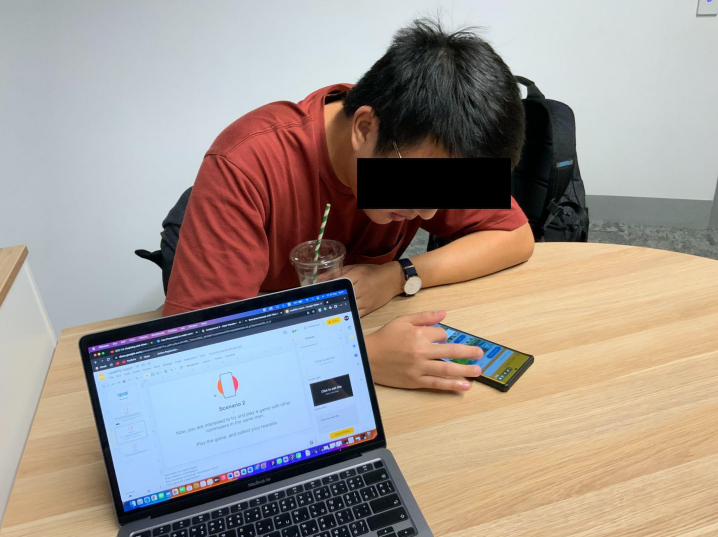
Testing phase 1: 3 Usability testing of night shift workers (room setting - based on User Scenarios).

Testing phase 2: User-Experience evaluation (Inside metro - based on Experience Scenarios)
Challenges + Design modifications based on feedback
One of the challenges we initially discovered through testing was verifying whether the user was a genuine Night shift worker accessing the Opal+ game mode. Participants were curious to know if they were playing with like-minded commuters or not. I wanted to ensure that the solution cater to the intended User group and makes them feel exclusive.
Therefore, I aimed to set up an Opal+ QR code that only activates after 3 pm and lets the users verify the train carriage, enter the Game mode and determine the recommended games based on real-time travel timings. This also ensures that the games are only played during the commute and not otherwise.
We initially planned to put the QR code on the station information board and inside the train next to the Sydney train map. However, we had to drop both ideas after testing because participants had trouble accessing the QR on the platform while hurrying, and it got blocked inside the train when a person in a wheelchair used that space, affecting others' privacy.

Usability Test report - severity of the problem.

QR Idea 1: QR beside the Sydney train network map.

Therefore, my next idea was to use the QR code as a sticker placed above each seat. On the app, a visual feedback page providing actionable steps has been added - to guide the user during the onboarding, reducing anticipation and confusion. This allowed participants to quickly and safely access the QR while preventing errors.

Results
This modification resulted in excellent navigation, use case and user experience providing concrete user satisfaction.

Another major issue we encountered was with the new Opal+ home dashboard, where participants were not sure about the information provided on the Mid-fidelity prototypes Game scorecard. Additionally, there was confusion in understanding the information presented and what actions to take forward.


Usability Test report - severity of the problem.
Left - Before Testing, Right - Changes made after feedback.
However, This was not the end.
Experience testing results provided in-depth details of how these changes were still confusing and unclear so the participant could take informed action. To simplify the Home page design, I studied Opal Travel Home page sections and mimicked them to maintain the information look and functions similar to Opal Travel. I kept usability factors such as memorability and learnability in mind while designing, which resulted in a pleasant user experience and smooth transition.

Results
This approach focused on the making the app easy to understand for the participants and helped me improve the designs, making them easier to use without needing to learn complex interactions, thus enhancing the overall user experience.

Reflections.
The non-linear journey of being an Interaction designer hostilely has always been fascinating to me. I kept discovering people, culture, and everyday scenarios where, despite the many technological advancements, we still need designers, always looking for ways to improve our lives. As a result, this makes me feel seen, important and valued as a responsible human designer.
This was my last UX project at uni, and through this project, I realized that the word “User Experience” is no longer similar to what I previously imagined, learned and thought it was. Mostly, because of its breadth and depth in understanding a society’s reality through real stories, behavior, sources of happiness, habits and everyday lifestyle - this project has opened a new exciting pathway for me to learn about demographics.
I worked with my fellow teammates, who collaborated to tackle the challenge and complimented each other’s skill sets. Although a Uni-project, the memorable aspect was our realistic approach - it made a clear difference between a 'no-constraints' Class project and a ‘real-life project.’ I specifically enjoyed this approach.
If I had more time.
If I revisit this project soon, I will invest my time in understanding the “experiences” of the games played during the commute and to what degree it solves the boredom. In terms of design, approach with a more in-depth understanding of UX strategies, market scalability and how they would effectively allow the brand to build a profitable business and retain its customers. Moreover, what would be the steps to take if the results go wrong?
Lastly, I would work closely with developers to explore the MVP's feasibility and acceptability with customers. If developed, it can provide statistical data based on which further fine-tuning and development can be carried forward.

